Wednesday, March 26, 2008

today i made...

Photobucket


the feather tree in a shell boat on a gusty day, ribbons streaming; it's amazing what the ocean tides wash up onto shore

Tuesday, March 25, 2008

to da Vinci

Photobucket
graphite on paper, after da Vinci


Photobucket
pen on paper, after da Vinci

a continuing of my interest in copying the works of da Vinci, initially inspired by a visit to the british museum where i was able to spend time drawing from a couple of da Vinci's actual silver point works on paper, not prints in a book. it made all the difference in the world.

a copy using silver point:
Photobucket
silver point on prepared paper, after da Vinci

Wednesday, March 19, 2008

car as art

Photobucket

probably the best use of a Volvo ever. just imagine if everyone did things like this with their dead cars' parts. it would make quite a magnificent menagerie.

Sunday, March 16, 2008

delightful melancholy

Photobucket Photobucket
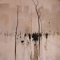
above, two pieces by contemporary artist Geoffrey Johnson
Photobucket Photobucket
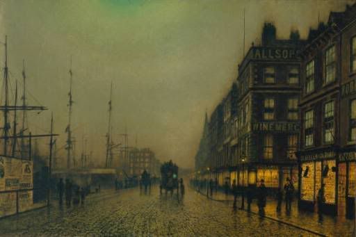
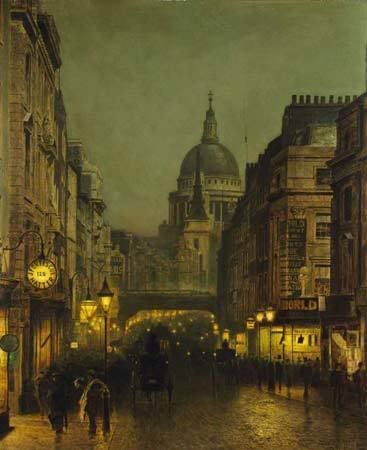
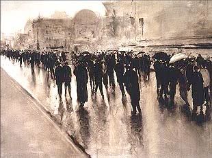
above, two pieces by victorian era (late 1800's) artist John Atkinson Grimshaw


i had been looking at some of Grimshaw's work earlier, and when i later ran across Geoffrey Johnson's work while sifting through the stuff of various artists, i was struck by how directly Johnson's work reminded me of Grimshaw's. there is a certain similar quality in the air, or the atmosphere, of the paintings. and while Johnson's work is of a lighter, cooler color than Grimshaw's, they both have a kind of sootiness, a wetness; a blurring and smudging of tones. they look like dreams.

the most intriguing bit for me, however, is the figures in each artist's paintings. both have depicted their figures as little more than black silhouettes, merging and diverging in varying degrees. they are dark and beautiful and haunting, exuding a mysterious poetic melancholy. Grimshaw's soot-filled, rainy air perfectly complements the blurry, foggy dampness of Johnson's world. i can imagine the figures moving among the various paintings, meeting, conversing, departing, belonging neither to one artist or the other, but both.

i am of the firm opinion that the work of these two artists should be shown side by side together in their own exhibition. someone should make that happen. i'll go see it if they do.

Wednesday, March 5, 2008

now, and then


"Self-eater #3" by Dana Schutz (2004ish) and "Burial of Atala" by Girodet (1813), respectively. 

now someone in the world believes that painting on the top is beautiful and a fabulous work of art.  i'm just glad that person doesn't have to be me.  talk all you want about how wonderfully thick the paint is applied, about the boldness of such lurid color choice and combination.  i can say with good deal of certainty at this point that my philosophy about art is that it should be universal.  art shouldn't have to be an acquired taste.  a true work of art resonates in the hearts of all.  i won't tell which of the two pieces shown most likely fulfills the aforementioned requirement; your first choice would probably be correct.


"Yellow and Gold" by Rothko.  this piece, as many others of Rothko's, resonates with me in a similar way as the Burial of Atala.  it has this power for a few reasons.  one is very practical.  the title, you'll notice, is simply the names of two colors.  the work is entirely unpretentious.  the title itself eliminates the typical abstract art question of "well, what is it supposed to be?"  um, well, let's see.  it's some yellow.  and it's some gold.  colors.  that's all.  the magic happens in the juxtaposition of these colors.  how do they relate to one another?  on the color wheel, they're analogous; which means they harmonize quite well.  so the experience of looking at them together is pleasant.  how do they relate to me?  i have a bias toward these colors that is inexplicable; they are attached to me and i to them in some magical way that dates back to some point in my childhood, or perhaps is a product of it.  i see this painting and am suddenly reminded of everything that has those colors; honey.  sunshine.  wheat grass.  orange roses.  autumn.  dusk in summer.  the scent of autumn leaves.  nostalgia.  spiced cider.  fireflies.  and then i have the memories of these things.  all this hits simultaneously as i see it, rather than following some kind of reactionary thought process.  it is emotive as well as intellectual.  this is how abstract art becomes meaningful for me.  but precious little of it is as honest and unassuming as Rothko's colors.  abstract art always seems to be trying to be something. perhaps because it's afraid of being simply colors which do nothing but flood our brains with memories and attachments that make us feel.  (then again, i may just be overly sensitive to colors; in which case, i'm glad there's an artist like Rothko to play to my sensitivity).

a sidenote on aesthetics:  it is interesting to notice that God has cared for aesthetic beauty since the beginning of time:  "And out of the ground the Lord God made every tree grow that is pleasant to the eye and good for food." Gen. 2:9 NKJV (emphasis mine).  now why would He make the trees pretty if beauty was lost on man?  because beauty is not lost on man.  we can talk about the most up to date and cutting edge art all day, but at the end of it, men still like beautiful women, and women still like beautiful men.  there is a standard.